

Print Ready Retro Streetwear Graphics: Buy, License, or Commission
Retro streetwear graphics are nostalgic, genre-specific visuals like 90s hip-hop logos, synthwave retrosuns, and vintage motorsport badges built for tees and hoodies. You get there three ways: buy finished tees straight from the source, license print-ready vectors from stock libraries, or commission a designer for custom art. Whichever route you take, heavyweight cotton and a garment-dyed finish separate a graphic that looks earned from one that looks printed yesterday.
TL;DR:
- Using vintage marketplaces for authentic 90s garments requires careful inspection due to inconsistent condition and sizing.
- Stock libraries offer print-ready graphics with licensing tiers, but some assets are restricted to editorial use and cannot be sold on products.
- Authentic retro styles demand specific color palettes, fonts, and textures that reflect their geographic and era-specific origins.
- Creating print-ready files requires vector formats and correct color modes tailored to the chosen printing method, with screen printing being the most durable.
- Limited-run, heavyweight, garment-dyed tees enhance the vintage look and hold value, especially when released in exclusive batches that never get restocked.
Table of Contents
- Where to Find Retro Streetwear Graphics
- What Are the Main Retro Streetwear Substyles?
- What Makes a Graphic Look Authentically Retro?
- Getting Your Files Print Ready
- How to Style a Retro Graphic Tee
- Why Heavyweight Blanks and Limited Runs Matter
- Do You Need a License to Use Retro Streetwear Graphics?
- Customizing Licensed Retro Graphics Without Getting Sued
- How Much Do Retro Streetwear Graphics Cost?
- Shop Curated Elite Bloodlines Picks
- Michael’s Perspective: Respecting Retro Visual Culture
- Sources
Where to Find Retro Streetwear Graphics
Every source has a trade-off between speed, exclusivity, and control. Know which one you’re solving for before you start scrolling.
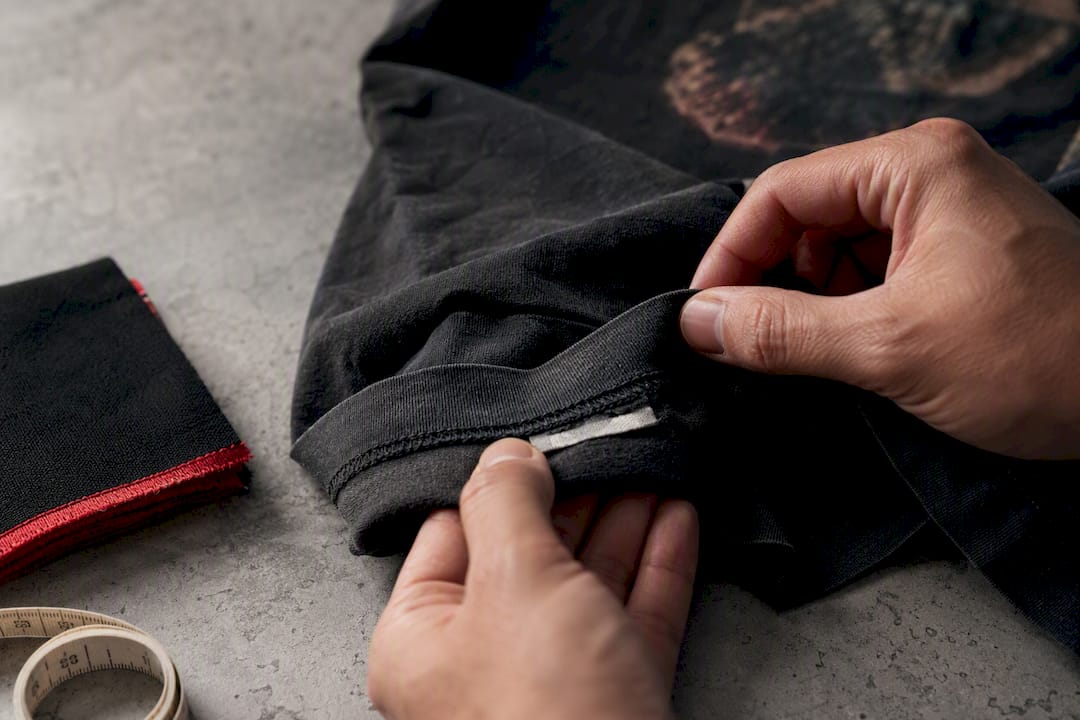
Resale marketplaces like eBay, Grailed, and Depop are the move if you want an actual vintage piece, not a reproduction. Highsnobiety’s breakdown of 90s revival culture notes that modern designers often mix authentic vintage pieces with new garments to nail the look while upgrading fit and fabric. The catch: sizing runs inconsistent, and “vintage” gets slapped on things that are barely a decade old, so check seller ratings and demand close-up photos of stitching and tags before you commit.
Stock and vector libraries are your best bet for print-ready files. Sites like Adobe Stock and Vecteezy carry millions of streetwear and vector graphics built specifically for apparel, but licensing tiers matter more than the price tag. Some assets are marked editorial-only, which means you legally cannot slap them on a shirt and sell it.
Indie artist shops and print-on-demand storefronts fill the gap between the two. They’re where limited-run, one-off art lives, and where a designer’s specific voice comes through instead of a generic template.
- Vintage marketplaces: real garments, real history, inconsistent condition and sizing.
- Stock/vector libraries: fast, scalable, but read the license before you print a single shirt.
- Indie shops and print-on-demand: unique art, smaller runs, direct support for working artists.
- Vetting checklist: file preview resolution, seller review count, and an explicit commercial-use license.
What Are the Main Retro Streetwear Substyles?
Pick a lane before you search, because “retro” without a substyle attached gets you a wall of unusable noise.
90s hip-hop leans on heavy block logos, bold color panels, and jewel-tone palettes layered over athletic-style fonts. According to Understanding 90s Street Fashion, the era’s signature look pairs oversized tees and jerseys with bomber jackets and stacked jewelry, and that same boldness carries straight into the graphics.
Synthwave and outrun pull from a totally different well: the striped retrosun, neon gradients, laser grids, and muscle car silhouettes lifted from 80s arcade cabinets and films like Drive.
Vintage motorsports favors badge-style emblems, muted palettes, and patchwork construction that reads more workwear than club night.
Collegiate and jersey style sticks to block type, team-patch layouts, and chest-number placement, the same visual grammar as a varsity locker room.
- 90s hip-hop: “old-school logo tee,” “boxy graphic,” “block letter streetwear”
- Synthwave/outrun: “retrowave tee,” “neon grid shirt,” “80s arcade graphic”
- Motorsports: “racing badge tee,” “vintage moto patch”
- Collegiate: “varsity block tee,” “jersey number graphic”
One more thing worth knowing before you search: sub-eras inside 90s hip-hop (Native Tongues, Wu-Tang, Bad Boy, Cash Money) each carry their own visual codes, so naming a specific year or crew in your search terms gets you sharper, more accurate results than “90s style” alone.
What Makes a Graphic Look Authentically Retro?
Four ingredients do almost all the work: color, type, texture, and where the art sits on the shirt.
Palette is the fastest tell. Highsnobiety’s coverage of 90s hip-hop style points out that color stories often trace back to geography: East Coast design leans on darker, utility neutrals, while West Coast design favors lighter, sun-faded blues. A designer who wants a graphic to feel grounded in a specific place uses that split on purpose.
- Choose the palette first. Match it to the substyle, not your favorite colors. Synthwave wants saturated neon on black; 90s nostalgia wants muted jewel tones on a worn cream or gray.
- Pick type that matches the era. Block athletic fonts for hip-hop and collegiate looks, condensed sans for motorsport badges, hand-script only when it’s doing a signature or tag detail.
- Add texture last. Halftone dots, film grain, scanlines, or slight misregistration simulate the imperfection of old screen printing, and this only works if the printer knows to preserve it instead of cleaning it up.
- Respect the template. A chest badge sits small and centered; a full-front graphic needs negative space around the edges; a back print can go big because there’s no seam or pocket to fight.
Pro Tip: Simulating misregistration by hand almost always beats a generic “grunge” texture filter. It reads as an intentional stylistic choice, not a Photoshop shortcut, and it holds up at actual garment scale instead of turning into mud.
Authenticity and legibility pull against each other constantly. A heavily distressed graphic looks incredible on a screen at 400% zoom and turns into an unreadable smear at 12 inches wide on a chest print. Build texture with the final print size in mind, not the file preview.
Getting Your Files Print Ready
A design that looks perfect on screen can fail completely at the printer if the file specs are wrong.
Vector formats (AI, SVG, PDF) are non-negotiable for anything with hard edges, logos, or type, since they scale to any size without degrading. Raster files (PNG or TIFF at 300 DPI minimum) work for photographic or painterly textures, but anything below that resolution prints soft and blurry.
Color mode depends on the print method. Screen printing wants spot or Pantone colors mapped to individual ink separations. Direct-to-garment (DTG) printing works from sRGB or CMYK files instead, since it’s closer to inkjet output than layered ink.
Each print method has a different trade-off:
- Screen printing: the most durable option and the cheapest per unit at volume, but it loses money fast on small runs or highly detailed gradients.
- DTG: handles full-color photographic detail and gradients well, at a higher per-unit cost and a shorter garment lifespan under heavy washing.
- Heat transfer: fastest and cheapest for one-off or sample runs, but it cracks and peels faster than either alternative over time.
If you’re converting a complex raster graphic for spot-color screen printing, the file needs major color blocks traced into vector separations, with one flattened layer per ink and clear trapping guidelines for the printer. Before sending anything to a print shop, confirm: file format and DPI, finished print size, exact ink or color count, and the specific garment blank you’re printing on, since heavyweight cotton behaves differently under heat than a thin blend.
How to Style a Retro Graphic Tee
Fit changes how a graphic reads almost as much as the art itself. Oversized fits let a full-front or back-print graphic breathe and dominate the silhouette; classic fits keep smaller chest-badge graphics proportional and clean. Men’s Oversized Streetwear Tees That Earn Respect breaks down exactly where that line sits.
Three outfit formulas cover most retro graphic tee situations, drawing on the regional style splits fashion writers have tracked for years in iconic 90s hip-hop outfits:
- East Coast rugged: oversized tee, dark denim, bomber jacket, work boots.
- West Coast laid-back: relaxed tee, faded shorts or joggers, low-profile sneakers.
- Elevated street-luxe: fitted or classic-cut tee, tailored joggers, minimal accessories, clean leather sneakers.
Pair heavy graphics with clean footwear so the shirt stays the focal point, not the shoe. For more full-fit breakdowns, Copy These Men’s Streetwear Outfits and this roundup of graphic tee outfit ideas are both worth a scroll.
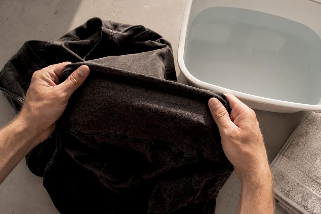
Care matters more on garment-dyed heavyweight cotton than on a basic tee. Wash cold, turn the shirt inside out to protect the print surface, and skip the dryer’s high heat setting, which is what actually cracks distressed graphics faster than normal wear does.
Why Heavyweight Blanks and Limited Runs Matter
A retro graphic only looks legitimate if the garment underneath earns it. Thin, bright blanks fight a distressed print; a heavyweight, garment-dyed tee lets texture and age show the way it should, which is exactly why Elite Bloodlines builds every drop on heavier cotton instead of a standard retail blank.
Limited-run releases matter for the same reason vintage pieces matter: scarcity is part of the story. A graphic tied to one drop, never restocked in the same run, holds cultural weight a mass-produced version never will. Michael, who covers apparel and print culture for Elitebloodlines, has watched that scarcity model consistently outperform open-ended catalog printing on both perceived quality and resale interest.
Do You Need a License to Use Retro Streetwear Graphics?
Yes, almost always, if you’re selling anything. Buying a stock graphic gets you a license, not ownership, and the terms attached to that license decide what you’re legally allowed to do with it.
Adobe Stock and similar libraries typically split licenses into standard and extended tiers. Standard licenses usually cover items produced in smaller quantities for personal or limited business use; extended licenses cover merchandise for resale, larger print runs, or products sold on physical goods. Some assets are flagged editorial-only, meaning they cannot legally go on a product you sell, no matter how good the license page’s search results look.
Recreating a real logo, mascot, or brand mark from the 90s, even as a “tribute” or “inspired by” design, is a separate and far riskier problem. Trademark and copyright protections on sports leagues, record labels, and brand logos generally don’t expire just because the design feels nostalgic. A graphic that references an era’s aesthetic (bold block type, jewel tones, a similar font family) sits in safer territory than a graphic that copies a specific mark.
Before you print and sell anything built on a licensed asset, check three things: whether the license explicitly covers apparel and merchandising, whether it allows the quantity you plan to produce, and whether the artwork references (rather than recreates) any protected brand element. When any of those is unclear, a quick message to the license holder costs nothing and saves you a takedown notice later.
Customizing Licensed Retro Graphics Without Getting Sued
Most licensed vector packs are built to be edited, and editing is usually where the real design work starts, not where it ends.
Recoloring is the simplest adjustment and almost always allowed under a standard commercial license: swapping a neon synthwave palette for muted East Coast neutrals, for instance, changes the entire feel of the piece without touching its structure. Combining elements from two separately licensed assets (a retrosun background with a hand-lettered logo) is common practice, but each source file still needs its own license checked individually.
What you generally cannot do, even after heavy customization, is take a licensed asset that closely mimics a real trademarked logo and push it further toward that brand’s actual identity. Editing doesn’t erase the underlying infringement risk if the base asset was already skating close to a protected mark.
For true one-off customization, commissioning an artist directly gives you the cleanest rights position. A work-for-hire agreement with a designer typically transfers full commercial rights to you, which sidesteps the tiered-license guesswork entirely. It costs more upfront than a $20 stock download, but for a brand or a resale-focused drop, owning the art outright is worth the difference.
Keep records. Save the license terms, the purchase receipt, and the artist agreement for every graphic you put into production. If a buyer or a platform ever questions your right to sell a design, that paper trail is the entire defense.
How Much Do Retro Streetwear Graphics Cost?
Costs split cleanly by route, and the gap between them is bigger than most first-time buyers expect.
A single stock vector license typically runs somewhere in the $10 to $80 range for standard commercial use, with extended licenses for larger production runs pushing higher. Finished vintage tees on resale marketplaces vary wildly, from bargain-bin finds under $20 to sought-after grail pieces well into the hundreds, depending on condition, brand, and scarcity.
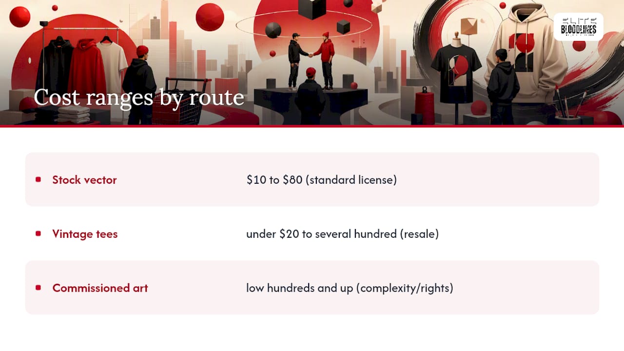
Commissioning an original graphic from an independent designer generally starts in the low hundreds for a single-color, print-ready design and climbs from there based on complexity, number of color separations, and whether full commercial rights are included in the fee. A multi-color, fully licensed piece built specifically for merchandising sits at the top of that range.
Finished, ready-to-wear graphic tees from a streetwear brand fall somewhere in between buying a license and commissioning custom art, since the design, printing, and garment cost are already bundled into one price. That’s the fastest path if your goal is wearing the look today rather than building a print business around it, and it’s why heavyweight, limited-run tees remain the most straightforward entry point for most shoppers.
Shop Curated Elite Bloodlines Picks
Skip the licensing spreadsheet and the printer back-and-forth entirely. Elite Bloodlines runs the substyles this guide just covered on heavyweight, garment-dyed blanks built to hold texture and age the right way, in limited runs that don’t get restocked once they’re gone.
The EB Graphic Tees collection covers bold, logo-driven pieces closest to the 90s hip-hop substyle. EB Heritage, including the Heritage Collection V1 Classic Fit, leans into throwback badge and collegiate styling on a true classic cut. Both come oversized or classic depending on how loud you want the graphic to read.
Every drop is limited. Once a run sells out, it’s gone, which means the piece you’re wearing isn’t sitting on a shelf in a hundred other closets. Check Current Drops now to see what’s still available before the next release replaces it.
Michael’s Perspective: Respecting Retro Visual Culture
Reviving a 90s logo or a synthwave retrosun only works if you understand what the visual language actually meant before you start remixing it. Too many “retro-inspired” graphics grab the surface texture, the grain and the halftone dots, without any sense of why East Coast palettes went dark and West Coast palettes went sun-faded, or why a specific hip-hop sub-era used the type it used.
That’s part of why limited runs on heavyweight blanks matter to me beyond the marketing angle. Scarcity forces intention. When a design isn’t getting reprinted forever, someone had to actually mean it. Drop your favorite substyle, hip-hop, synthwave, motorsport, in the comments. I’m curious which era readers keep coming back to.
— Michael
Sources
- Understanding 90s street fashion
- 90s Hip-Hop Fashion: The Era-by-Era Blueprint - Highsnobiety
- REP+ Retro Muscle Car Sunset Synthwave Streetwear Tee – Aprasi