

10 Copyable Streetwear Color Combos: Hex Codes & Elite Bloodlines
Limit your visible palette to three or five colors, pick one anchor shade you already trust, and let the 70/20/10 split and the 3-color rule do the rest. That’s the whole game. Everything below gives you copyable palettes, exact placement rules, and the hex codes to build fits that look intentional instead of thrown together.
TL;DR:
- The 70/20/10 color split advises wearing around 70 percent of your outfit in a neutral or anchor color, 20 percent in support, and 10 percent in accents for balance.
- Using hex codes for colors ensures consistency across varying lighting and fabric textures, which impact how saturated or vibrant a color appears.
- Choosing the right anchor piece, often a neutral or versatile item already in your wardrobe, is crucial for building cohesive and intentional streetwear outfits.
- Seasonal adjustments involve shifting to warmer tones in fall and winter or lighter shades in spring and summer, while keeping core colors stable across seasons.
- Fabric texture influences color perception, with matte cotton deepening saturation and glossier fabrics washing out or amplifying accent colors under light.
Table of Contents
- Ready-to-Copy Streetwear Color Combos
- The 3-Color Rule and the 70/20/10 Split, Explained
- Palette Examples With Hex Codes You Can Copy
- Where to Put Your Accent and How to Pick an Anchor
- Why Elite Bloodlines Recommends These Formulas
- How to Incorporate Seasonal Trends Into Streetwear Color Combos
- Matching Streetwear Colors With Different Skin Tones
- Using Color Combos to Express Personal Style and Brand Identity
- Balancing Bold Colors With Neutrals for Streetwear
- Impact of Fabric Texture on Perceived Color Combinations in Streetwear
- Author’s Quick Take: Test Before You Buy Anything New
- Build Your Anchor Piece With Elite Bloodlines
- Sources
Ready-to-Copy Streetwear Color Combos
Stop overthinking your closet. These are ten combos you can build tonight, organized by vibe. Each one names an anchor, a support piece, and an accent so you know exactly where every color lands.
- All Grey Tonal. Light grey hoodie (support) + mid grey joggers (anchor) + graphite sneakers (accent). Monochrome dressing that photographs clean under any light.
Notice the pattern. The accent almost never covers more than a hat, a pair of socks, or footwear. That restraint is what separates a fit that looks planned from one that looks accidental.
The 3-Color Rule and the 70/20/10 Split, Explained
The 3-color rule says an outfit reads as coordinated when it sticks to three main colors: one anchor, one support, one accent. Streetwear stretches that slightly, usually landing on a 3 to 5 color visible palette, but the anchor still leads.
The 70/20/10 breakdown tells you how much space each color gets, not just which colors you pick. Most streetwear styling guides frame it this way: one color leads while the others support it, which keeps the eye from bouncing between competing pieces.
- 70% base: your pants and jacket or outerwear. This is usually your anchor color, worn across the largest surface area.
- 20% support: your tee, hoodie, or underlayer. A close cousin to the anchor or a calm neutral.
- 10% accent: hat, jewelry, socks, or laces. This is where you take the risk.
Do: pick your accent color first if you’re building around a specific piece, like a red chain or a yellow cap, then reverse-engineer the base and support around it.
Don’t: put two loud colors in the accent slot. One neon cap plus one neon lace is two accents fighting for attention, not one.
Pro Tip: If you’re not sure whether a color is your anchor or your accent, ask which piece covers more fabric. Whichever one does is your base, full stop.
Palette Examples With Hex Codes You Can Copy
Hex codes matter more than most people think. Screens, product photos, and printed graphics all render color slightly differently, and testing exact values keeps your fit consistent whether you’re checking it in a mirror or on Instagram. Curated palette sets, including Produkto’s streetwear generator, typically settle on a primary, a secondary, and one or two accents totaling three to five colors, which lines up with what works on the street.
| Palette Name | Base (Hex) | Support (Hex) | Accent (Hex) | Garment Roles |
|---|---|---|---|---|
| Urban Edge | #1A1A1A | #4A4A4A | #FFC600 | Black jacket + grey tee + yellow laces |
| Blood & Concrete | #1A1A1A | #C0392B | #E5E5E5 | Black joggers + rust-red hoodie + white sneakers |
| Desert Utility | #C2A878 | #6B7A5E | #2B2118 | Sand cargos + sage shirt + espresso boots |
| Washed Denim | #46586B | #F5F1E8 | #8C7853 | Denim jacket + cream tee + tan cap |
The Urban Edge combination works because near-black and midget share the same cool undertone, so the yellow accent reads as a spark rather than a clash. Swap the yellow laces for a plain white pair, and the same outfit shifts from “loud statement” to “clean minimal” without touching anything else.
For fabric and finish, matte cotton holds saturated colors like the rust-red in Blood & Concrete better than a glossy poly blend, which tends to wash out under flash photography. If you’re shooting fit checks, natural light near a window shows true color far more accurately than indoor bulbs, which usually skew warm.
Quick swaps: Desert Utility gets easier to wear if you drop the espresso boots for plain white sneakers. Washed Denim gets bolder with a burgundy beanie instead of the tan cap.
Where to Put Your Accent and How to Pick an Anchor
Your anchor color should already live in your closet, not get bought special. Black, cream, denim, olive, and washed navy work as anchors because they’re neutral enough to support almost any accent you throw at them.
Where the accent lands changes how loud it reads:
- Outerwear: a colored jacket or bomber dominates the silhouette since it covers the most surface area. Best for combos you want people to notice from across the block.
- Footwear: sneakers are the safest accent zone because they’re low on the body and easy to swap out daily.
- Headwear: a cap or beanie sits close to the face, so it draws attention fast without requiring a wardrobe change.
- Accessories: chains, socks, and laces are the lowest-commitment accent option, ideal for testing a new color before buying anything.
Silhouette matters here too. An oversized hoodie spreads color across more visual space than a slim-fit tee, so the same shade reads as more dominant in a boxy cut. Heavyweight cotton also holds color density better than thin jersey, which can make an identical hex value look noticeably paler once it’s on your body instead of on a screen.
Why Elite Bloodlines Recommends These Formulas
Michael, who writes the Elite Bloodlines blog, builds every outfit breakdown around the same anchor-and-accent logic covered here. Elite Bloodlines applies it directly in limited drops, using tonal base pieces that let one heavyweight graphic tee or accent piece carry the whole look. If you want to see the formula applied to real fits, the men’s streetwear outfit guide and the kids’ streetwear looks both show anchor and accent choices in action.
How to Incorporate Seasonal Trends Into Streetwear Color Combos
Seasonal shifts don’t mean rebuilding your palette from scratch. They mean nudging the same anchor toward a different temperature.
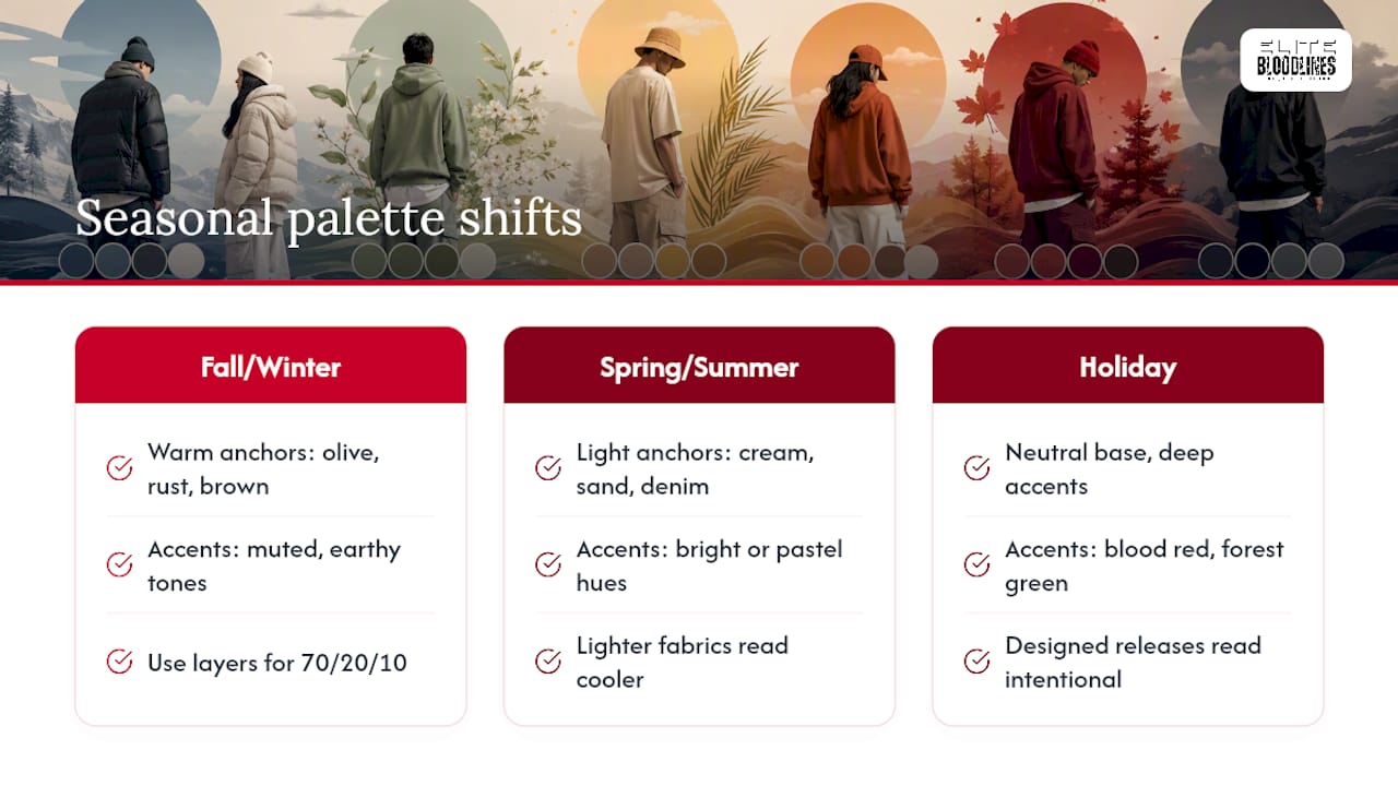
In fall and winter, warm anchors like olive, rust, and washed brown feel right because they echo the season visually, even if the fabric underneath is the same cotton you wore in July. Layering also gives you more surface area to work the 70/20/10 split across: a jacket, a hoodie, and a base layer means three chances to place color instead of one.
Spring and summer flip that logic. Lighter anchors, cream, sand, light denim, read cooler and pair naturally with brighter accents since you’re not fighting heavy fabric weight or bulky layers. This is when pastel-loud combos, like the grey and lavender pairing from the palette list above, feel most natural instead of forced.
Holiday drops and limited seasonal releases often lean into deeper, saturated accents, blood reds, forest greens, because they read as intentional rather than trend-chasing when the base stays neutral. The mistake to avoid is swapping your entire palette every few months just because a color trended online. Keep your anchor and support colors stable across seasons, and only rotate the accent. That’s a far cheaper and more reliable way to stay current than replacing your whole rotation twice a year.
Matching Streetwear Colors With Different Skin Tones
Color theory in streetwear isn’t just about the clothes, it’s about how those colors sit against your actual skin tone, and this is where a lot of guides go quiet.
Warmer skin tones (with golden or olive undertones) tend to look strongest next to earth-tone anchors, olive, rust, camel, warm denim, because those shades share the same undertone family and avoid a washed-out contrast. Cooler skin tones (with pink or blue undertones) usually pop more against true black, charcoal, navy, and cool grass, since those anchors don’t compete with the skin’s own undertone.
Neither rule is absolute. The safest move if you’re unsure which category you fall into is to test your anchor color near your face first, in a cap or hoodie, before committing to it across an entire outfit. If a color makes your skin look duller in a mirror under daylight, it’s probably fighting your undertone rather than complementing it. If it makes your face look brighter or more rested, that’s usually a sign the anchor works.
Accent colors are more forgiving here because they cover less surface area and sit farther from the face, on laces, socks, or a chain. That’s part of why the accent slot is the right place to experiment with a bold color you’re not fully sure suits you yet.
Using Color Combos to Express Personal Style and Brand Identity
Your palette is a signature, whether you’re building it on purpose or not. Someone who defaults to black and blood red every time is saying something different than someone who leans cream and sage.
Pick two or three anchor colors you return to across seasons, and your fits start reading as a personal identity instead of a series of unrelated outfits. This is exactly how streetwear labels build recognition: a consistent tonal approach, repeated across drops, becomes a visual signature people associate with the brand before they even see a logo.
The same logic applies at an individual level. If you consistently reach for olive and rust, people start associating that combination with you specifically. That’s a form of branding, even if you never intended it as one. It’s also why swapping your entire palette every week can actually work against you: consistency is what makes a personal style memorable rather than just varied.
Accent colors are where you can push boundaries without abandoning your identity. Keep your anchor and support colors steady, and rotate the accent to reflect a mood, a season, or a specific piece you want to show off. You get personal expression and consistency in the same outfit.
Balancing Bold Colors With Neutrals for Streetwear
Bold color needs a neutral to lean on, or it stops reading as a statement and starts reading as noise. This is the entire logic behind the 70/20/10 split: the loudest color in your fit should almost always occupy the smallest space.
A neon yellow beanie against an all-black outfit works because black absorbs the visual weight and lets the yellow stand alone as the single focal point. Swap that black base for a second bold color, say, a bright blue jacket, and now the eye has two competing focal points instead of one, which is exactly the “too many competing pieces” mistake that makes outfits feel chaotic rather than curated.
The safest neutrals for anchoring bold accents are black, charcoal, cream, and washed denim. All four have low enough saturation that they won’t compete with a bright accent color, no matter how loud that accent gets. If you want to run two bold colors in one fit, the fix isn’t to avoid it entirely, it’s to separate them by placement. A red cap and a green sneaker, worn with an all-neutral base, can work because they’re on opposite ends of the body and never visually collide the way a red jacket and green pants would.
Impact of Fabric Texture on Perceived Color Combinations in Streetwear
The same hex code looks like two different colors depending on what it’s printed or woven onto, and this is the part color charts never show you.
Matte, heavyweight cotton absorbs light and renders color as deeper and more saturated, which is why a rust-red hoodie in thick cotton looks richer than the identical shade on a thin poly blend. Glossy or synthetic fabrics reflect light instead of absorbing it, which washes out saturation and can make a bold color look pale or plasticky under flash photography or direct sun.
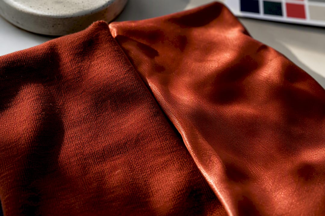
Texture also affects how “loud” an accent color reads. A neon accent on a smooth, glossy fabric grabs attention almost aggressively, since the shine amplifies the color’s intensity. The same neon on a brushed or fleece texture feels calmer, because the fabric’s surface scatters light rather than bouncing it straight back. If you’re trying to tone down a bold accent without changing the color itself, switching to a heavier, matte fabric is often the easier fix.
This is worth remembering when you’re building a fit from photos or online swatches. Colors always shift once they hit real fabric, so treat any hex code as a starting point, not a guarantee, and check the actual garment in daylight before deciding a combo doesn’t work.
Author’s Quick Take: Test Before You Buy Anything New
You don’t need a new wardrobe to test a combo. Swap your laces, your cap, or a chain for a single day and see how it actually sits against pieces you already own. Take one photo in daylight and one in person, since screens lie more than mirrors do. If it works, build from there. If you try a fit worth sharing, post it, comparing notes with other people testing the same rule is half the fun.
— Michael
Build Your Anchor Piece With Elite Bloodlines
Every combo on this list depends on having one solid anchor piece worth building around, and that’s exactly the lane this streetwear brand works in. Heavyweight graphic tees and limited-run drops can carry a fit on their own, so a single piece can function as your anchor or your accent without extra layering.
If you want a place to start, the EB Graphic Tees collection has the kind of bold, tonal pieces that slot straight into the 70/20/10 structure covered above. For accent pieces that carry a heavier statement, like your accessory or footwear rotation, a partner guide on transitioning gym wear into street style walks through similar placement logic for performance pieces. Browse the current drops before the limited run sells out, and build your next fit around a piece that’s already doing the work for you.
Sources
- The 3-color rule in clothing: how to use color daily — Obvious Magazine
- Color theory for streetwear — Viral Clothing
- Streetwear Color Palette Generator – Produkto